Client Project Overview
"ECHO" was a first attempt at a new social media application for a small California based start-up company. Through geo-tagging and location based messaging an end user could have public or private conversations over a secured network. User preference such as "radius field of display" would allow a user to see or post topics based on the tagged location. ECHO was a platform designed for delivering a digital message board, coffee shop experience, and personal city chatroom, all catering to one end user. The overall goal was to help create a more versatile way for people to meet and discuss any topic on their own terms and in a convenient, easy-to-use format.
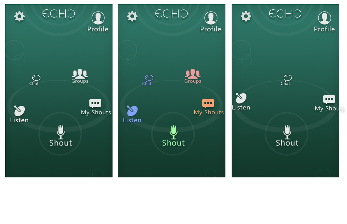
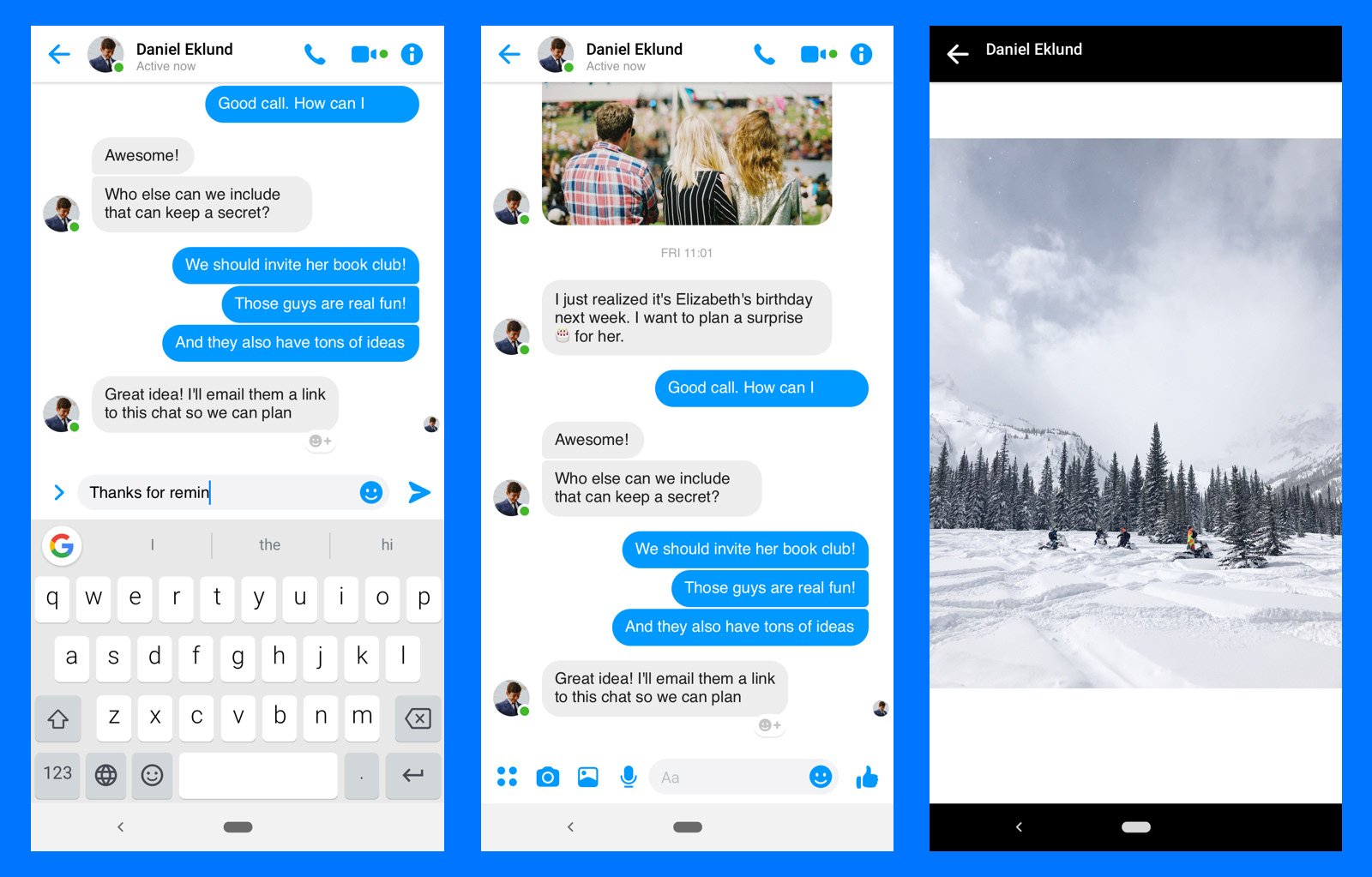
Through the geo-tagging feature, a "Shout" would be tied to a location that could be interacted with by other users (based on original poster's preferences) while keeping the user's actual location private.
The ECHO app dashboard was designed to keep track of all of an end users ongoing conversations; sync with other applications such as Grubhub, Yelp, and Uber; and integrate with other social media platforms like Facebook.
Discovery
I was hired to do upfront user research, competitive analysis, initial designs, and early UI development and coding. Challenges on this project included time available, the team’s size, and the potential for scope-creep. The project had no dedicated Product Manager, so I took on the majority of the research, discovery, and project management responsibilities in addition to the design. I worked alongside back-end developers that built out the framework on the geospatial metadata for integration with SMS messages and RSS feeds.
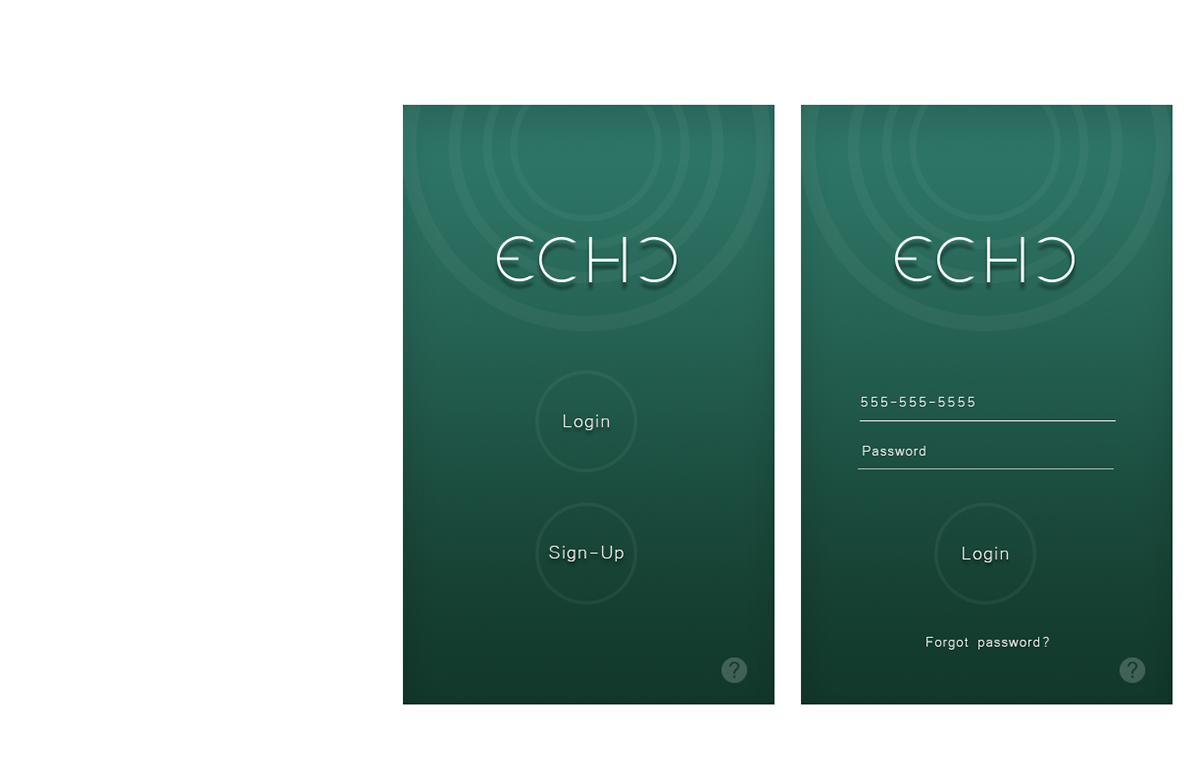
I examined other popular messaging apps like Facebook and Twitter, which verify identity by collecting confidential details such as social security number, previous known addresses, and phone number. Verified user identity was crucial to the goals of ECHO, so these examples provided helpful guidance on how to do so in a trustworthy, user-friendly way.


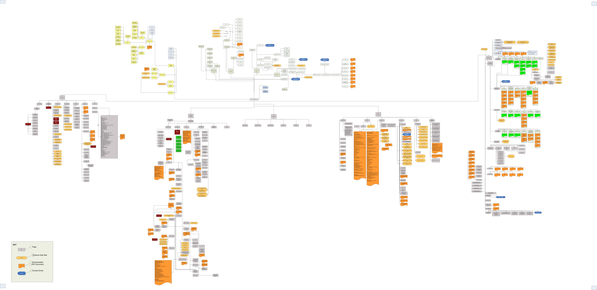
Finally, I convened with the Dev Lead on our mobile development team to get a better understanding of the known technical limitations of our current system. We then mapped out all of the variations that can exist in our experience based on combinations of different features that each user could have enabled. It turned out to be a highly complex web of user states, dependencies, and architectural anomalies, yet the exercise yielded an important insight for us.
Plan to Prototype to Build
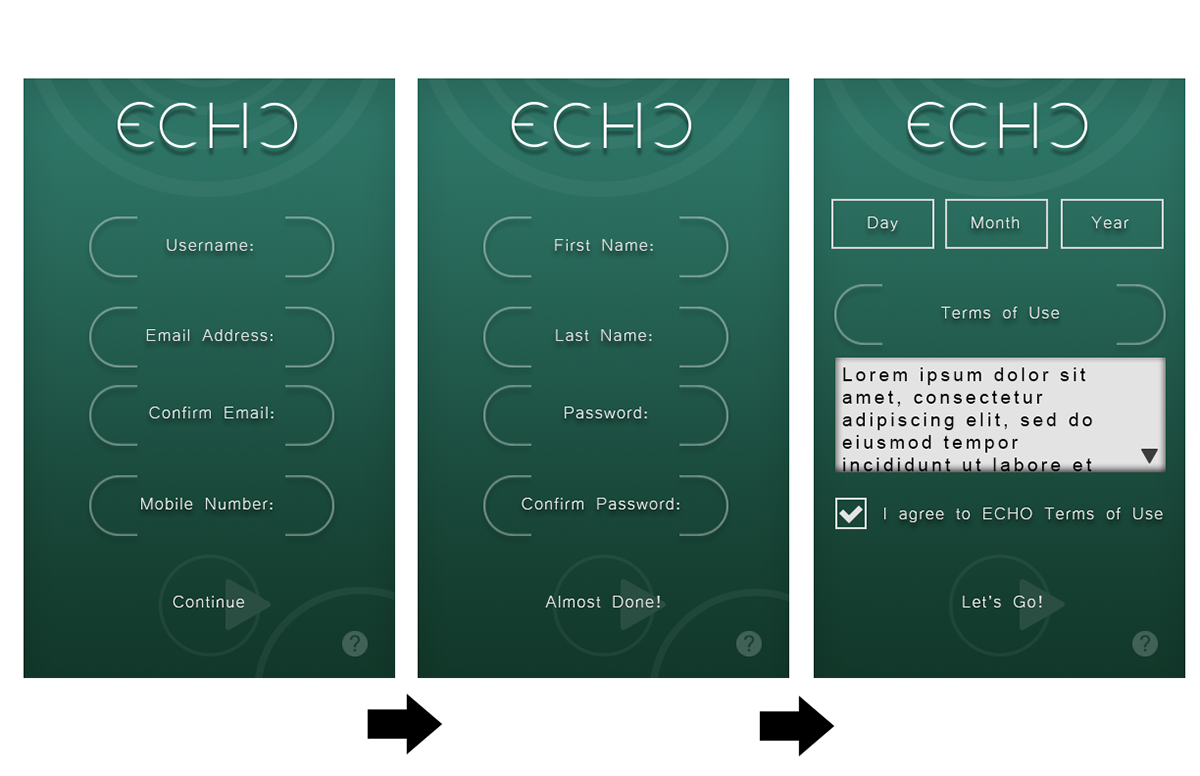
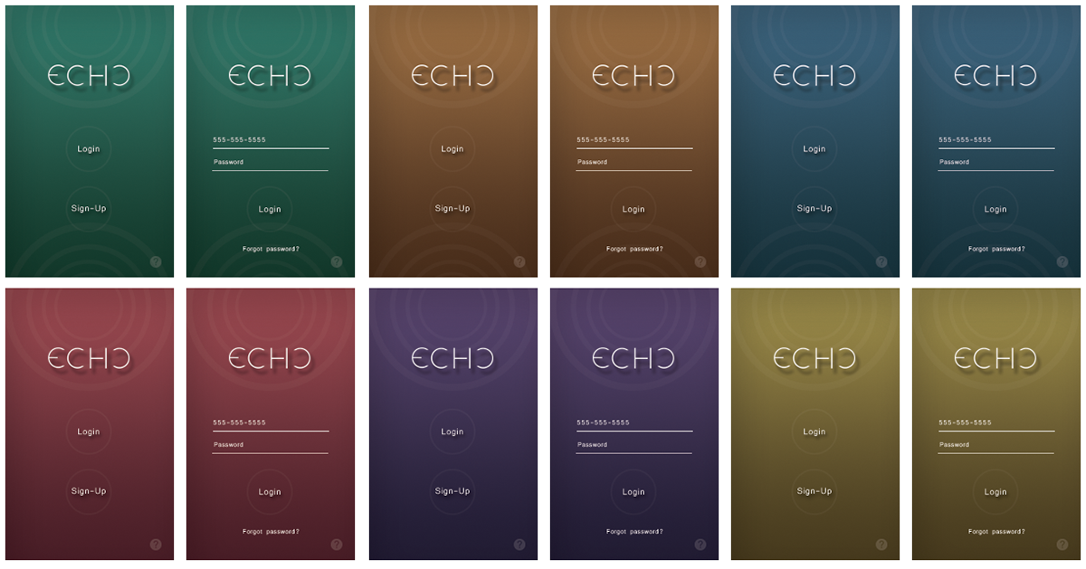
Through discovery we gained a broad base of knowledge about the business requirements, existing user pain points, and limiting factors constraining the project. Once the full scope was laid out I began storyboarding and creating simple wireframe flows. I determined we should first put the majority of our efforts towards improving the UX, visual design, and content strategy throughout the sign-up experience and geotagged text messaging feature. Narrowing our focus to these aspects allowed us to:
-Bring a friendlier, more welcoming tone to the experience through an elevated visual design language
-Clarify confusing steps in the sign-up flow by refining the content strategy;
-Reduce the cognitive load on each screen by enhancing the UX
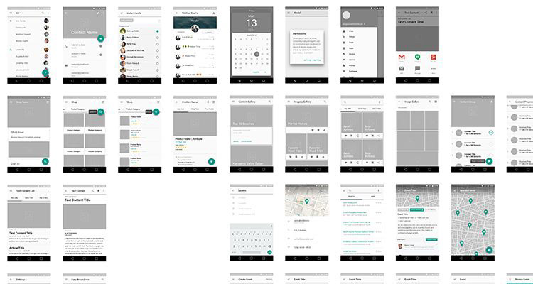
Next, I began sketching and building out a prototype. With the guardrails of the API limitations, I laid out the necessary steps of the flow, in their required order, and then began filling in details. Once I had a basic idea of the look and feel, I created a clickable prototype to share with the Engineering team for first reactions.
Once the backend systems were in place, I built out the front UI to begin user testing. At this point the start-up put this project on hiatus due to budget issues, and my contract completed shortly after.